· Petr Korab · Data Visualization · 5 min read
Contour Plots and Word Embedding Visualisation in Python
Contour plots are simple and very useful graphics for word embedding visualization. This end-to-end tutorial uses IMDb data to illustrate coding in Python.
Introduction
Text data vectorization is a necessary step in modern Natural Language Processing (NLP). The underlying concept of word embeddings has been popularised by two Word2Vec models developed by Mikolov et al. (2013a) and Mikolov et al. (2013b). Vectorizing text data in high-dimensional space, we can tune ML models for tasks like machine translation and sentiment classification.
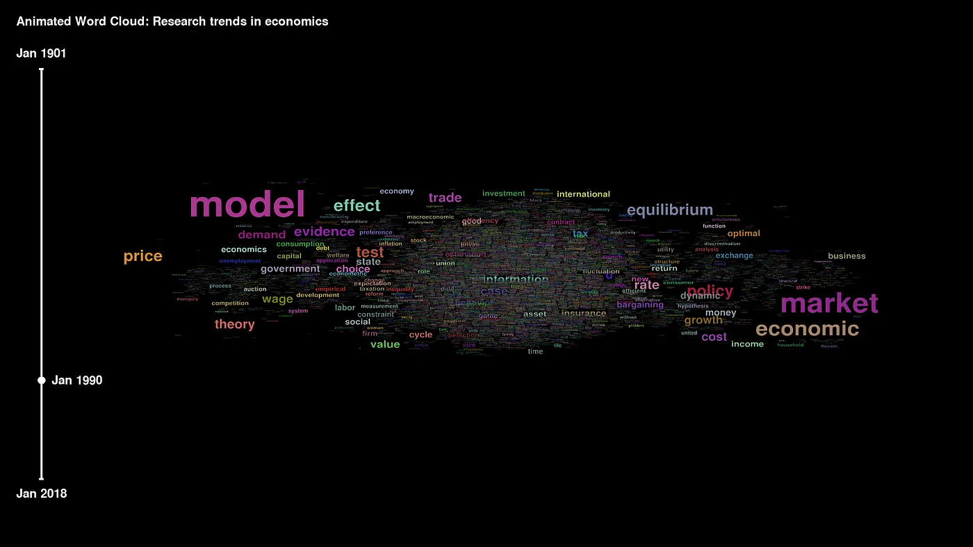
Word embeddings are typically plotted as 3-D graphs, which brings some difficulties in presenting them easily in papers and presentations. Here, the contour plot is a simplification of how to tackle 3-dimensional data visualization, not only in NLP but originally in many other disciplines. Contour plots can be used to present word embeddings (i.e., vector representations of words) in a 2-D dimensional graph. This article provides a step-by-step tutorial for the visualization of word embedding in 2-D space and develops the use cases where contour plots can be used.
What are contour plots?
A contour plot enables the visualization of three-dimensional data in a two-dimensional plot. It is a 2-D diagram that uses circles (often colored) to represent the third axis. Any point on the circle has the same value on the third axis. Here is the graphical representation of the same 3-D dataset in a contour plot:
Figure 2. Contour plot displaying 3D data, source: code available from here. This type of graph is widely used in cartography, where contour lines on a topological map indicate elevations that are the same. Many other disciples use contour graphs, including astrology, meteorology, and physics. Contour lines commonly show altitude (like the height of geographical features), but they can also be used to show density, brightness, or electric potential (Glen, 2022).
Step-by-step guideline
Back to NLP in Python, we will illustrate contour plots on the classic IMDb movie reviews dataset that is shared with the Attribution 4.0 International license. The empirical application follows the strategy I developed in the article Clustering Textual Data with Word2Vec (Korab, 2021) except for the last visualization step. The Jupyter notebook with a complete python code is here.
Corpus preparation and Word2Vec model training
First, we will do the exact data pre-processing operations as in (Korab, 2021). Next, the Word2Vec model from the Gensim library vectorizes the text corpus and provides word embeddings. This code trains a Word2Vec model with Gensim == 4.2.0 for 200 dimensions considering only words with occurrences larger than 10:
Dimensionality reduction with Principal Component Analysis
In the next step, we need to reduce the dimensionality of data from 200 dimensions to 3-dimensions that can be visualized in a Cartesian three-dimensional space. Here, Principal Component Analysis (PCA) is a standard solution:
Here is what the vectorized data looks like:
Figure 3. IMDb data vectorized with Word2Vec, dimensionality reduced with PCA Contour plot visualization Finally, we will display the data in a contour plot.
Vectors obtained with Word2vec capture the semantic and syntactic qualities of words, and the model groups semantically similar words close to each other. Contour plot helps to clearly visualize the complex dataset in a simple and easy-to-understand plot.
The visualization part involves (1) pivoting coordinates into a matrix structure using the code offered by Miller (2020), (2) generating a contour graph, and (3) labeling words in the plot. The python coding for all of these steps:
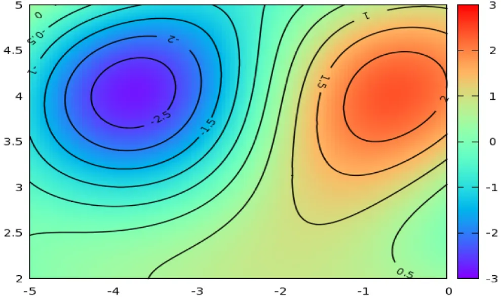
And here is the contour plot for the first 60 embeddings:
Press enter or click to view image in full size
Figure 4. Contour plot in 2-D of word embeddings. We can see that the Word2Vec model groups the words “film,” “films,” “movie,” and “movies” close to each other in all 3 dimensions. Similarly, “character,” “director,” and “actors” are close to each other. For publication quality figures, check the Matplotlib documentation to format annotation of some of the overlapping words.
For comparison, let’s look at the 3-D contour plot showing the same data:
Press enter or click to view image in full size
Figure 5. Contour plot in 3-D of word embeddings. Conclusions Contour plots are less used but highly useful graphics for word embedding visualization. Nice examples include data stories in all kinds of presentations and formatting charts in research papers. In a certain threshold, 3-D embedding visualization in papers and presentations might get unclear and confusing. Contour plots, on the other hand, improve the explanatory power of graphs while keeping their information value. Their benefits increase with the complexity of 3-dimensional data helping to tell more about the datasets’ structure.
The complete code, including all examples, is on my GitHub.
Petr Korab is a Python Engineer and Founder of Text Mining Stories with over eight years of experience in Business Intelligence and NLP.
References
[1] Glen, S. 2022. Contour Plots: Definition, Examples. StatisticsHowTo.com: Elementary Statistics for the rest of us!

[2] Korab, 2021. Clustering Textual Data with Word2Vec. Python in Plain English.

[3] Mikolov, T., Sutskever, I., Chen, K., Corrado, G. S., Dean, J. 2013a. Distributed representations of words and phrases and their compositionality. Advances in Neural Information Processing Systems 26 (NIPS 2013).

[4] Mikolov, T., Chen, K., Corrado, G. S., Dean, J. 2013b. Efficient estimation of word representations in vector space. Computation and Language.

[5] Miller, A., P. 2020. Contour plots in Python with matplotlib: Easy as X-Y-Z. Alex P. Miller blog, Feb 24, 2020.