· Petr Korab · Data Visualization · 6 min read
Advanced Visualisations for Text Data Analysis
Explore n-gram word cloud, chord diagram, and a bubble chart, and their implementation in Python
Introduction
This article will survey a couple of slightly more advanced graphics for text data visualization in Python. More precisely:
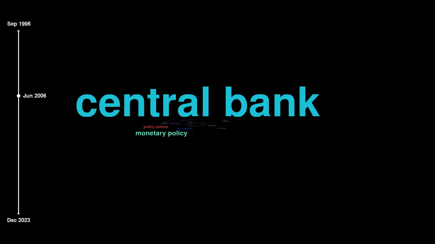
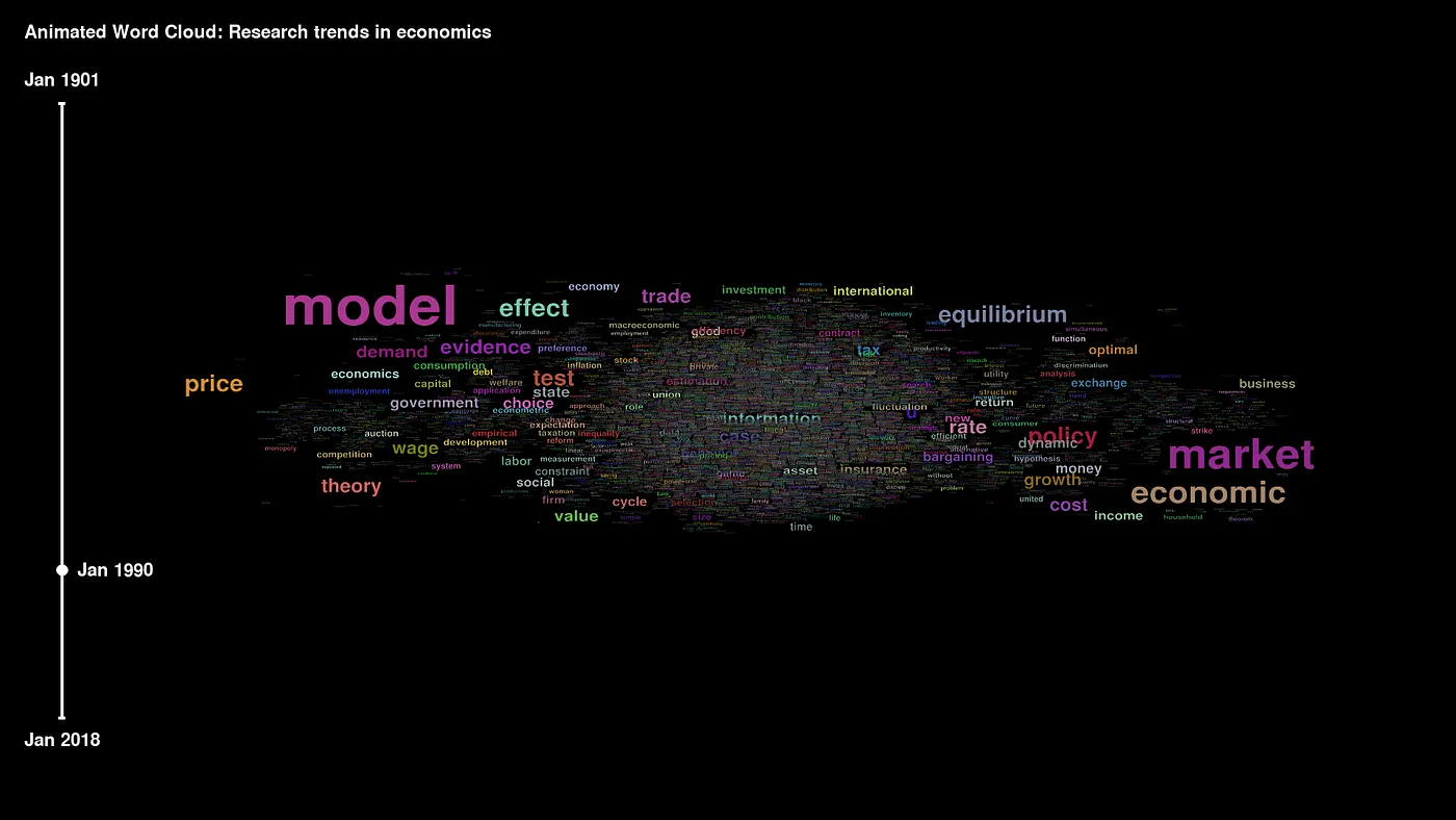
N-gram word cloud: to display the frequency of higher-order n-grams
Chord diagram: to show connections between several entities and their strength Packed bubble chart: visually engaging display of word frequencies To illustrate their applications and python coding, I use the classic IMDb 50K Movie Reviews (data license is here). A subset of data was already pre-processed and cleaned from numbers, stopwords, and special characters.
#1: N-gram word cloudStandard word cloud from Python’s wordcloud library displays unigrams (single words such as “cat”, “table”, or “flower”). We will explore a slightly more advanced version of the graph, which plots the frequency of bigrams and trigrams (i.e., two and three consecutive words).
Press enter or click to view image in full size
Image 2. Bigram word cloud, Image by author
Press enter or click to view image in full size
Image 3. Trigram word cloud, Image by author
Bigram word cloud First, we import the data for positive and negative movie reviews:
Collocation_threshold = 2 and collocations =True parameters tell Python to display bigrams in generated wordcloud objects:


We use matplotlib to display the image.

Press enter or click to view image in full size

Photo by Geri Mis on Unsplash
Trigram word cloud
Trigrams and higher-order n-grams (e.g., 4-grams) are generated using generate_from_frequencies(trigrams_dict), where trigrams_dict is a dictionary of n-grams and their frequencies.

In our case:

Press enter or click to view image in full size

Image 4. Dictionary with trigrams and their frequencies
Here is the code for generating wordcloud objects from trigrams and their frequencies for negative and positive sentiment samples.


Word clouds in Image 3 are generated similarly to the chart for bigrams.

#2: Chord diagram
A chord diagram is a method of displaying the inter-relationships (flows or connections) between entities. Creating the graph requires some elementary knowledge of network theory which is very nicely explained in Erik Ma’s e-book Network Analysis Made Simple.
In the graph, the data is arranged radially around a circle. The relationships between the entities are typically drawn as arcs, and their size is proportional to the importance of the connection (Data Visualisation Catalogue, 2022).
Press enter or click to view image in full size
Image 5. Chord diagram, Image by author
In our data, we are interested in how qualities of movies, such as “special effects” or “best supporting actor”, are discussed with 7 popular movies and their ratings (e.g. “good movie”, “bad movie”, “waste time”). The chord diagram helps us better interpret and present the reviewers’ opinions by analyzing the relations between bigrams (trigrams) in the corpus.
nodes (all str): qualities, movie titles, and verbal rating edges (int): co-occurrences in the movie reviews We will proceed with the following steps:
prepare data for a graph net create a network graph object visualize the network in a chord diagram
- Data prep The pre-processed IMDb data has a nodes and edges structure. We see that, for example, “bad movie” bigram was mentioned 40 x with “special effects” in the same review.
Image 6. Data for text network, Image by author
Create a network structure NetworkX is a Python package for the creation and study of complex networks. This code reads the data, creates a network structure, and plots a graph of the network:
Prepare a chord diagram Nxviz is a Python library for building rational network visualizations of NetworkX graph objects. This example uses nxviz==0.6.3.First, we calculate the degree of each node (see Nxviz documentation for reference). Next, we formalize the edges from the data.
CircosPlot is a chord diagram implementation in Nxviz. Here is the code creating the diagram (Image 5).
Chord diagram of movie reviews might indicate that many reviewers rate James Bond movies poorly because of bad acting, and they might get it compared to Interstellar. Saving Private Ryan is ranked well because of photography, while Hobbit is rated well in special effects.
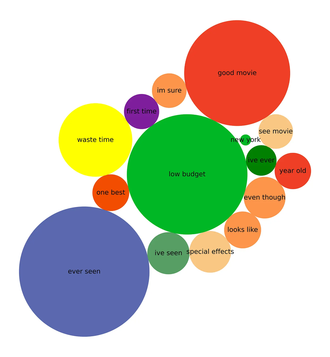
#3: Packed bubble chartA packed bubble chart displays data in a cluster of circles. Its basic building blocks are (Tableau, 2022):
Dimensions define the individual bubbles
Measures represent the size and color of the individual circles. The positioning of the bubbles is usually optimized for compactness, making the plot nicer and better to present. In the IMDb data, the most frequent bigrams represent a dimension, and their frequency is a measure of size in a bubble chart in Image 7. The colors are set randomly.
Press enter or click to view image in full size
Image 7. Packed bubble chart of bigrams and their frequencies, Image by author Probably the simplest way to make a packed bubble chart in Python is to use functions from the BubbleChartclass specified in the matplotlib’s documentation. We’ll use the class without any modifications.
The data is stylized a bit so that we can better illustrate the size of circles. Colors are selected from the matplotlib’s color palette. Here is what the sample looks like:
Next, we call the BubbleChart class with a bubble_spacing parameter which specifies the minimal spacing between bubbles.
Finally, the packed bubble chart in Image 7 displays the data.
Press enter or click to view image in full size
Photo by Pixabay on Pexels
Conclusion This article has suggested three more complex graphs for plotting text data. Here are some of their possible applications:
N-gram word cloud:
Summary of public announcements
what has the US president said about breaking into the Capitol? how have the Chinese president’s public statements developed over time? Summary of article titles and abstracts
what are the main keywords in articles published on a specific topic (e.g., use of blockchain in economics)? Chord diagram:
Text network analysis
visualize many-to-many relationships and their strength discover complex structures in the data (such as customers using the same email address to receive specific discounts) Packed bubble chart:
Data story-telling
helps to illustrate the problem, introduce stylized facts, and prepare engaging presentations Jupyter notebook with a complete code is available on my GitHub. Feel free to use it on your data.
Petr Korab is a Python Engineer and Founder of Text Mining Stories with over eight years of experience in Business Intelligence and NLP.
References
[1] Tableau Desktop and Web Authoring Help. Build a Packed Bubble Chart. Retrieved 2022-5-7 from https://help.tableau.com/current/pro/desktop/en-us/buildexamples_bubbles.htm.

[2] The Data Visualisation Catalogue. Chord Diagram. Retrieved 2022–5–7 from https://datavizcatalogue.com/methods/chord_diagram.html.