· Petr Korab · Data Visualization · 7 min read
Animated Word Clouds: A Novel Way for the Visualization of Word Frequencies
Python tutorial on preparing animated word clouds that make a word frequency presentation stunning

Introduction
Word clouds have recently attracted a lot of attention for their simplicity in showing word frequencies in an interesting way. Technically, this type of graph is based on n-grams that are contiguous sequences of items from a sample of text or speech. Put in a chart; you can easily see which topics, words, or emotions are most common in the data.
Michael Kane and his colleagues collected 250 most frequent words found in the Science journal abstracts from 1980 to 2014, and developed a dynamic version of word cloud, called the Word Swarm. The Python codes are freely available from their GitHub under the terms of public license.
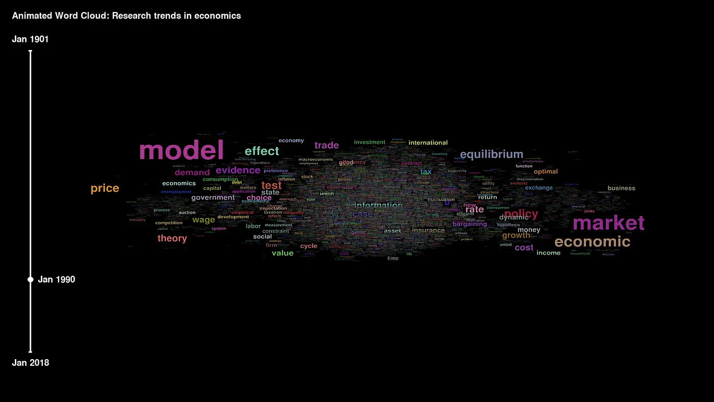
We think that animated word clouds are a fantastic way of telling a story about your data, and they should be used more widely. In a recent project, we collected meta-data of research articles from prominent economic journals from 1900 onwards to illustrate the preparation of a video file with a word cloud.
In this article, you’ll go through:
Word cloud applications in economic research, business intelligence, and analysis of sentiment; Step-by-step introduction to creating animated word clouds. Word cloud applications Word clouds have recently found many applications in business intelligence, economic and financial research, and understanding sentiment in the text. Let’s review some interesting examples.
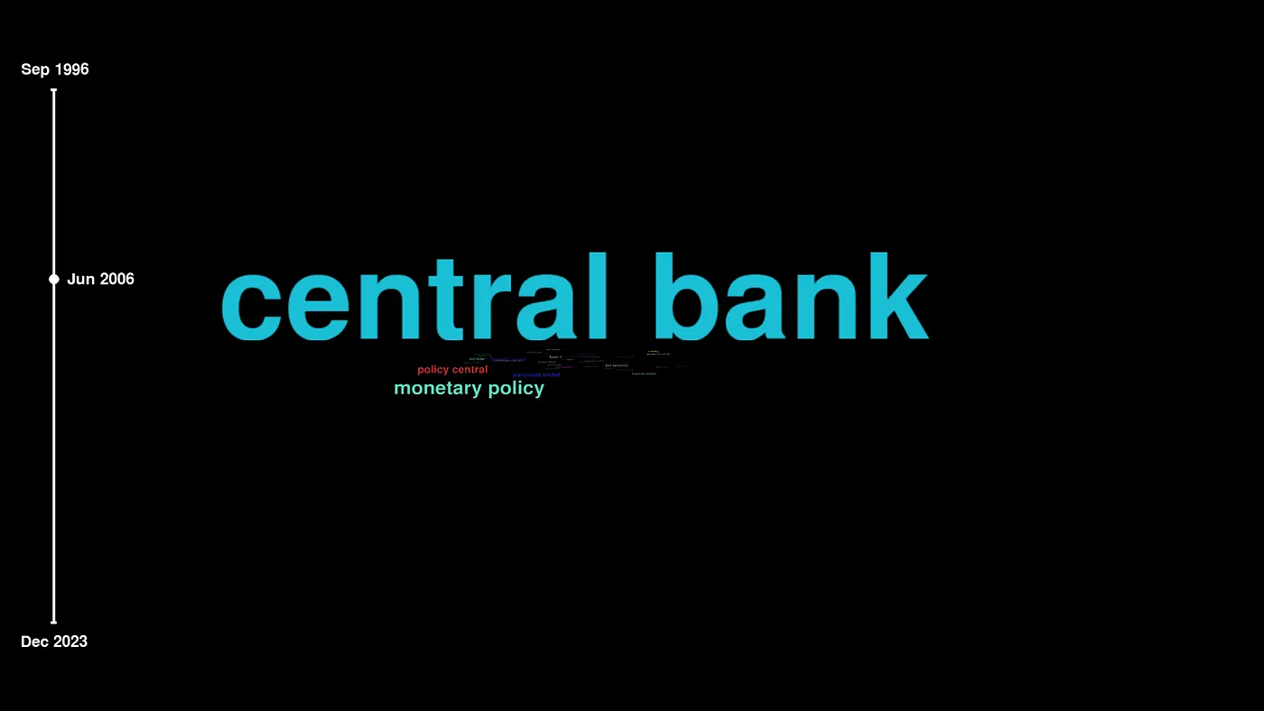
In empirical research in finance, word clouds improve understanding of the central bankers’ statements and interpret their content. In an exciting article, Feldkircher, Hofmarcher, and Siklos (2021) collected thousands of speeches made by central bankers in Europe and analyzed their content. With the help of word clouds, they found related topics, words, and patterns in the bankers’ communication that were not previously discovered.
In the influential article published in the Journal of Economic Literature, Bowles and Carlin (2020) present word clouds for words that students replied to the question: “What is the most pressing problem economists should be addressing?” to illustrate the need for change in teaching economics.
In business, companies need to understand customers’ opinions and product reviews, and word clouds have become very useful here. A quick look at the plot can reveal customers’ potential problems, and analysts don’t need to go through all the product reviews individually. They instead use business intelligence (BI) programs to explore customer data. All of the leading BI tools on the market provide in-built word cloud plots and functionalities; see Tableau, Looker, and Power BI implementation.
Animated Word Clouds
It is essential to recognize the authors of the original WordSwarm framework. See Michael Kane and his GitHub page with the complete set of Python codes. We only changed some parts of their scripts, mainly those related to data pre-processing and implementation in Python 3.8 (original WordSwarm was tested with Python 2.7). Otherwise, the core of our animated word cloud remains very similar to Michael Kane’s original.
The idea behind animated word cloud is to display how the frequency of words in the dataset changes over time. The time dimension includes years (and possibly months), such as the publication year of articles. The size of a word is represented by its frequency in a particular year.
Font size illustrates the importance of the words. Over time, the words with the highest frequency pop up from the center of the cloud, leaving words with minor frequency in the center. As far as we use absolute and not relative frequencies, the font size is generally increasing during the video, which reflects the rising number of economic publications.
The result is an MP4 video that you can see at the beginning of this article.
Step 1: Data cleaning and n-gram calculation
Data preparation depends on the structure of your raw data, and the Python implementation will differ for each project. Our code is available on GitHub.
The main steps of pre-processing involve:
Data cleaning and removal of stop words
N-gram (n=1) calculation Reshaping data into the final input format The first step involves data cleaning and removing stop words that do not have substantial information content and can be removed at the beginning. These stop words include, e.g., “he”, “to”, “and”, “a”, “in”, “it”, “s”, “I”, “that”, “had”, “on”, “for”, etc.
Word frequencies in our data are extracted from titles of research articles and are essentially n-grams of n=1. To learn more about n-grams, go here.
Finally, reshape your data to contain a first column of words and subsequent columns with the words’ frequency with each date specified by the first row of the CSV file.
The pre-processed data has this format:
Press enter or click to view image in full size
Cleaned data with word frequencies. Step 2: Calculate the WordSworm In this part, we load input data and prepare around 6 000 PNG images that will later create a video file. Here is an example picture:
Press enter or click to view image in full size
The WordSwarm program uses PyGame and Box2D libraries that are (or possibly were) used to make 2D games in Python. We exploit the WordSwarm framework and only tune the parameters, such as zoom, number of pictures (=length of the video file), parameters of the time axis, resolution, center of the word cloud, offset of images, etc.
A great benefit for users is that you don’t need to change much of the code, provided that you load the data in the required format. This saves a lot of your time since the core framework is already prepared.
In our project, the core WordsSwarm framework remains unchanged. We do small changes in the wordsSwarm.py and pygame_framework.py to adjust the parameters to fit the screen better and rewrite the code for Python 3.8. Our codes are here.
Step 3: Prepare the video file
The final step uses the frames2video.bat file available on the WordSwarm project website to convert the individual PNG frames into an MP4 file. In our project, the video file has 98 MB with 1920 x 1080 resolution and 2 min 55 seconds length, which is large enough to tell a story about the trends in our data.
Conclusion
Data storytelling is a field of data science that has rooted in business. It is often easier to persuade a stakeholder to decide with an interactive well-styled dashboard than provide simple graphs and statistics. Forbes (2016) cited data scientist Stephen Few explaining why numbers have an important story to tell:
“They rely on you to give them a clear and convincing voice. Any insight worth sharing is probably best shared as a data story. The phrase “data storytelling” has been associated with many things — data visualizations, infographics, dashboards, data presentations, and so on. Data storytelling is a structured approach for communicating data insights, and it involves a combination of three key elements: data, visuals, and narrative.”
We believe that Animated Word Clouds can tell stories about your data in empirical financial and economic research anytime your data has a longer time span and textual character. The video in the introduction of this article helps articulate research trends using word frequencies in article titles in the leading economic journals (American Economic Review, Econometrica, Quarterly Journal of Economics, Journal of Political Economy, and Review of Economic Studies) over the last 118 years.
We use data from JSTOR Data for Research and extensively process it for this article. The first part of data collection, transformation, and cleaning is outlined here. With the animated word cloud in about three minutes, we can visualize trends in economics nearly from its beginning.
AnimatedWordCloud is now a Python library (PyPi, GitHub). Complete codes for this tutorial are on our GitHub.
Acknowledgements: This article is prepared as part of readings for the MSc. course Research Design that is taught at Zeppelin University in Fall 2021. We fully comply with the terms and conditions of use of JSTOR data. We also acknowledge the original Michael Kane’s WordSwarm contributions, which we used as the primary source for our project. We also fully comply with the terms of the General Public License.
References:
[1] Feldkircher, Martin, Hofmarcher, Paul, Siklos, Pierre. 2021. What’s the Message? Interpreting Monetary Policy Through Central Bankers’ Speeches. SUERF Policy Briefs, No 153.

[2] Bowles, Samuel, and Wendy Carlin. 2020. What Students Learn in Economics 101: Time for a Change. Journal of Economic Literature, 58 (1): 176–214.

[3] Dykes, Brent. 2016. Data Storytelling: The Essential Data Science Skill Everyone Needs. Forbes, Mar 31, 2016. Available from: https://www.forbes.com/sites/brentdykes/2016/03/31/data-storytelling-the-essential-data-science-skill-everyone-needs/?sh=40f1adf552ad.