· Petr Korab · Text Networks · 8 min read
Text Network Analysis: Generate Beautiful Network Visualisations
Discover how to visualize text networks in the circular, radial, and matrix forms: circos, hive, and matrix plots. At the same time, learn the dos and don’ts of plotting text networks.
Introduction
This article develops a series on text network analysis in Python. It builds on Text Network Analysis: Theory and Practice, laying down the fundamentals of text networks, and Text Network Analysis: A Concise Review of Network Construction Methods, focusing on data preparation and network construction strategies.
The last article split the strategies for constructing a text network into (i) net is drawn from the raw text, and (ii) the net is built on the pre-processed data with the edges and nodes clearly defined. In this article, we will expand the second option and use the pre-processed classic IMDb 50K Movie Reviews (see the data license) to illustrate the following network graphics:
circos plot: to visualize a network in a circular layout hive plot: to structure the network graph along several axes matrix plot: to plot a net in its matrix form. We will not cover the standard network diagram but rather focus on more advanced plots. Pyvis is a very handy Python library that enables the interactive configuration of graphic widgets and can be effectively used here. This tutorial by Khuyen Tran provides an excellent introduction. Also, arc plot, which forms the basis of circos, can intuitively be developed on text networks.
Best practices for text network visualization
In the first step, let’s summarize a couple of dos and don’ts for network visualization that generally apply to most network structures, not only text networks. Although selective and primarily based on personal experience, following them helps avoid some major pitfalls in plotting network data.
#1: Start with a goalNetwork data structures can be very complex. To make the visualization job successful, figure out clearly at the beginning (1) the story you want to tell with the graphics and (2) which relationships you want to highlight.
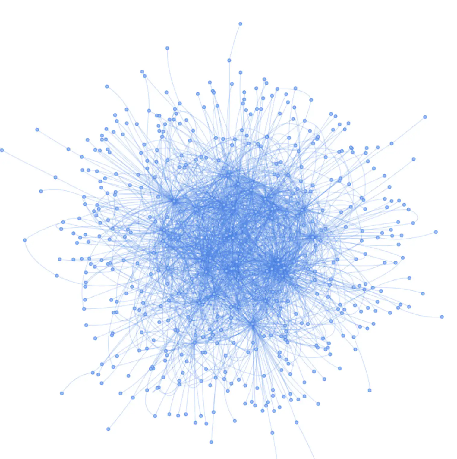
#2: Avoid the “hairballs”Press enter or click to view image in full size
Figure 2. Hairball — example. Image by author ”The purpose of visualization is insight, not picture.” Ben Sneiderman.
A “hairball” is a term that refers to a graph showing connections that are so dense that they can’t be usefully visualized. We might get to a situation where we plot a chart with a significant number of nodes (one rule of thumb being 30 nodes or more, as Ma(2022) suggests), where the visualization results in a hairball mess. Figure 2 presents one such example.
The possible solutions include:
sort nodes: reduce the number of nodes to the most significant ones (e.g. only those with edges over certain weight) group nodes: pre-process the data differently, group the nodes into specific categories select suitable graphics: some plots, such as circos plot, can better display data with many nodes adjust the graph properties: image size, etc.
#3: Prioritize significant edgesIn many cases, we are more interested in specific nodes, and corresponding edges, than the rest of the data. Let’s give them a priority, increase the width of the edge line, or use a specific color to distinguish them, if this makes sense for your data story.
”The heart of a graph lies in its edges, not in its nodes.” John Quackenbush, Harvard School of Public Health.
Here is an example:
“With the COVID-19 virus spreading, contact tracing has become quite important. In an infectious disease contact network, where individuals are nodes and contact between individuals of some kind are the edges, an “important” node in this contact network would be an individual who was infected and who also was in contact with many people during the time that they were infected.” (Ma and Seth, 2022).
#4: Node positioning and coloring make a differenceCorrect positioning and coloring of nodes in the graph might improve the graph’s informative value while keeping the data structure unchanged.
To be most informative and communicative, a graph visualization should first prioritize node placement in a fashion that makes sense. (Ma and Seth, 2022).
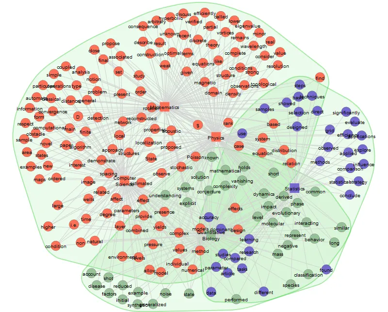
As an example, we can look at two movie networks and their characteristics from movie reviews (Figure 3). The unsorted graph on the left may take a while to comprehend. Sorting nodes, placing movie titles and features on the opposite sides of the plot, and coloring the groups of nodes improved understanding even of such a small network. Check the code for the graph here.
Press enter or click to view image in full size
Figure 3. Sorted vs. unsorted nodes in network plot. Image by author Circos plot — from network to a circle Let’s now discover three graphs that are built upon a network. A circos plot, or more generally, a chord diagram, displays the network in a circular shape.
Press enter or click to view image in full size
Figure 4. Circos plot. Source: Korab. Advanced Visualisations for Text Data Analysis The edges in a circos plot are typically drawn as arcs, and their size is proportional to the importance of the connection. Krzywinski et al. (2009) originally developed the idea of displaying relations in a circular layout for visualizing genomic data, and it soon took root in other areas, e.g., labor economics (Malhotra et al., 2016) and applied machine learning (Zoabi et al., 2021).
The core idea with many modifications is, in essence, the same: to display nodes and edges in a circular shape, often adding several more advanced insights on top of the graphics.
There is a large variety of tools and libraries that implement a Circos-like type of graph. In Python, they are Nxviz, Circos, PCircos, or pyCircos. For python coding using preprocessed text data, you might use my previous article Advanced Visualisations for Text Data Analysis, as a reference.
Hive plot — from network to a coordinate system
A hive plot is a slightly more advanced network visualization method in which nodes are placed on radially oriented linear axes according to a well-defined coordinate system.
Press enter or click to view image in full size
Figure 5. Hive plot with preprocessed movie reviews. Image by author In the graph, nodes are assigned to one of two (or more) axes, which may be divided into segments. Edges are drawn as curves, which can be annotated with color, thickness, or label to communicate additional information. Read the original Krzywinski et al. (2012) to learn more about the underlying theory.
Hive plot’s clear benefits for data visualization in text mining are:
Inter-group and intra-group connection visualization: a hairball-type network can be drilled down to discover relations within and between groups of nodes. Direct network visual comparability: it is possible to assess the network structure of two or more networks because hive plots are founded on network properties, not on the aesthetic layout. The research question: which movie studios are predominantly compared by reviewers in movie reviews?
The data is transformed into the nodes and edges that reflect the co-occurrence of movie names in the reviews. Each row in the data indicates how frequently these nodes appeared jointly in a single review. Here is what the data looks like:
Also, we will use node attributes for each node:
Implementation
Python offers several libraries for hive plots— the most common are Nxviz and Hiveplotlib. While nxviz provides coding efficient hive plot graphics, Hiveplotlib offers more complex solutions with better documentation. Let’s use the former and prepare an efficient solution that answers the research question.
First, let’s import everything we will need:
Next, let’s read the data on nodes, edges, and their attributes and create a graph G:
Finally, this piece of code groups and colors the nodes by node attributes and prepares an annotated hive plot:
From an elementary example in Figure 5, we might see that there are few intra-group edges between Marvel movies and many intergroup connections between Marvel and Lucasfilm movies. Reviewers mainly compare Marvel and Lucas films, likely because these studios produce similar genres of movies.
Matrix plot — from network to a matrix
A matrix plot displays a network in its matrix form. The nodes are on the x- and y- axes, and a filled square represents an edge between the nodes.
Press enter or click to view image in full size
Figure 6. Directed and undirected graphs. Image by author using Nxviz Plotting a network in a matrix form helps determine whether the graph is directed or undirected. Let’s use an example from Stack Overflow:
”Imagine graphs as a set of pumps that can send liquid to others when they are connected. In directed graphs, the arrow shows where it comes and where the liquid goes; in the undirected graph, it goes from both ways.” (stackoverflow.com).
In movie reviews, developing an example of both directed and undirected graphs is challenging. Most situations, e.g., actors playing in the same movie, result in an undirected graph. Let’s use a different instance of standard networks:
The nodes in figure 6 are airports, and the edges are flights between them. In the right network, flights travel from Heathrow (node 2) to Paris Charles de Gaulle (node 6) and back (the graph is undirected, and the plot is symmetric). In the left part, airplanes fly from Heathrow to Charles de Gaulle, but not back (directed graph with some asymmetry).
Conclusion
Most of this article generally refers to network visualization and requires text data to be transformed into edges and nodes. With text data, the nodes are semantic concepts, keywords, groups of topics, or other entities which have a string type. To draw a network from the raw text such as reviews, movie titles, or newspaper articles, use a tool that implements a community detection algorithm, such as Infranodus or Textnets.
A Jupyter notebook with the code for this tutorial is here.
Petr Korab is a Python Engineer and Founder of Text Mining Stories with over eight years of experience in Business Intelligence and NLP.